CRAP analysis on a web site done by a student
An assignment in my Introduction to Interactive Media syllabus that always catches my students’ attention is the “CRAP Assignment.” While some may think that every assignment is CRAP, it’s not actually the case for this one. You see, CRAP is an acronym for contrast, repetition, alignment and proximity – four design qualities that can be assessed and improved to create an overall better design.
The CRAP acronym was not my idea. It was coined by the author Robin Williams in her book “The Non-Designers Design Book.” Her introduction does a great job of explaining why being able to identify design qualities allows us to be better designers.
Williams tells a story of visiting her childhood home one Christmas in which she discovered a tree she had never noticed before. She had been given a tree identification book and began reading about the Joshua Tree. She thought she had never seen one before. Then she went for a walk in the neighborhood and noticed Joshua Trees all around her! What she learned from this experience was that if you can’t identify something, you can’t fix it!
In Williams’ book, she primarily focuses on print pieces and improving the layout using the CRAP principles. But I have found that these principles apply to interactive media as well.
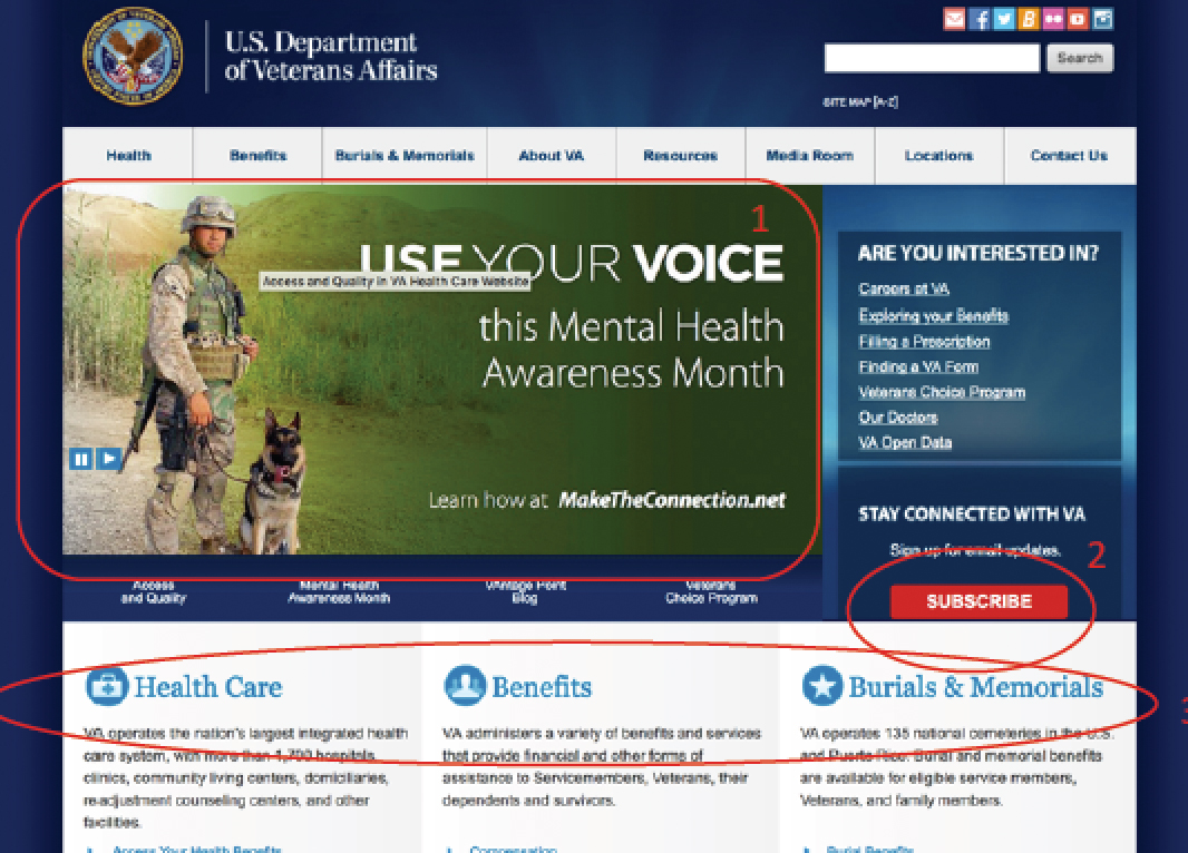
The assignment I give my students is to do a CRAP analysis on an existing web site. In it, they must identify each principle, explain effective use of this design principle and then find a visual example within in the web site and state whether it is good or bad.
The CRAP assignment is a satisfying one to give students because I get to witness the Joshua Tree phenomenon occur again and again. Students see things they have never seen before, have new language to articulate the design issues and how to fix them.
Check out a couple of successful student examples.