Since interactive digital media is a visual medium, one lesson I try to impart on my Introduction to Interactive Media students is how typography can have a dramatic effect on the look and feel of an interactive application. In fact, I believe that the typeface can say much more than the words themselves.
My favorite example to show students is four different versions of my fictional restaurant’s sign. Each sign says the same thing: “Julie’s Restaurant,” but they are all rendered in a different typeface. I then ask the students what type of restaurant each one represents. It’s amazing how much the students concur in their responses.
The first sign is most often described as a sign for a burger joint, the second, a funky cafe, the third, a BBQ spot, and the 4th, a fancy Italian restaurant. When I ask them which is the most expensive restaurant, they all agree – the last one.
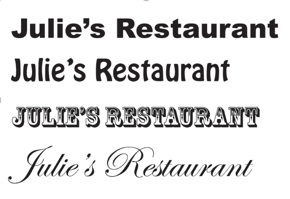
What I want students to get out of this exercise is to understand how much of an impact type choices can make. If you were a restaurant owner and designing your sign – people are going to make assumptions about the food you serve and the priciness of the restaurant just by the typeface you choose for your logo! It makes a difference!
In a follow-up discussion, I ask students to look critically at the way type is being used in the word around them. In this discussion, student’s share examples of how the type chosen for a logo helps to communicate the brand identity. Here are some of my favorites that my students have come up with.
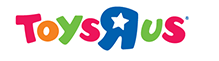
The Toys R US logo is colorful with different sized, squishy looking letters all set at different angles. The R is backwards and has a star inside of it. All of these choices make the brand look like fun and for kids.
The Barbie logo looks like it was written with a fat marker which is something a kid might do. The cursive and pink color feel girly.
![]()
The Chick-fl-A logo looks handwritten which gives a casual impression. The goofy chicken illustration that is part of the C makes it clear that the emphasis of the restaurant is in serving up chicken.
![]()
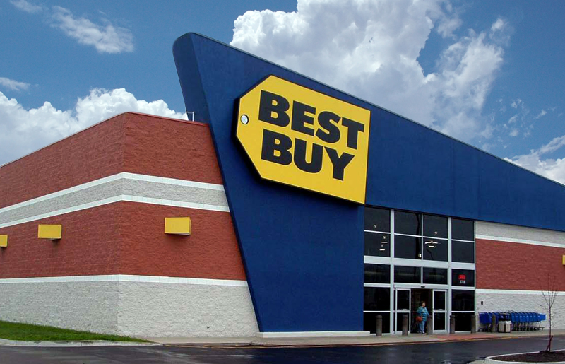
The Best Buy logo is bold and straight-forward. It’s also rendered inside a big price tag. They are communicating that they are a big store that is serious about offering low prices on their merchandise.
The Best Buy logo is bold and straight-forward. It’s also rendered inside a big price tag. They are communicating that they are a big store that is serious about offering low prices on their merchandise.
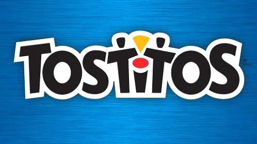
The Tostios logo has letters that are squeezed together like people squeezed in a crowded party. They communicate that Tostitos are great party foods by rendering the letters in the middle as people who are holding a chip over a bowl of salsa which is the dot on the i. Very clever.”
After doing these exercises, I believe my students start to see how type choices are important and are very considered when communicating visually. They will likely think more critically about the type choices they make in the future.