A LOT has changed in the last 20 years in the world of web design. Sites have evolved from simple “brochure-ware” to flashy animated experiences to bold, interactive experiences that respond to the device that requests them. While it’s challenging to keep up with these evolving trends, it also means web designers will always have their work cut out for them.
ESS, Electronic Support Systems, is a manufacturer’s representative business offering a complete line of high quality products to support electronic equipment. (Yes – it’s pretty sexy.) The original site was likely built in the late 1990s and in desperate need of a redesign.
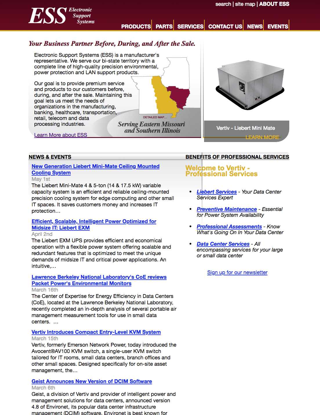
The original ESS site
As you can see, there are a lot of issues with the old site. First of all – it’s really wordy! We have learned that no one really takes the time to read all this copy. Web copy needs to be presented in digestible chunks.
The width of the site is also very small. This is because it was designed for the much smaller and lower resolution monitors of the past.
The other issue with the site is the color scheme. The logo is maroon which is a challenging color to work with. It can look really dated because it was so popular in the 90s. The gold accent color isn’t doing the maroon any favors – it just makes it look even more dated.
The marketing team at ESS is ready for a new web site and I got pulled in to help with the design. So here’s the first attempt at the new home page design. We’ll see how the client likes it!
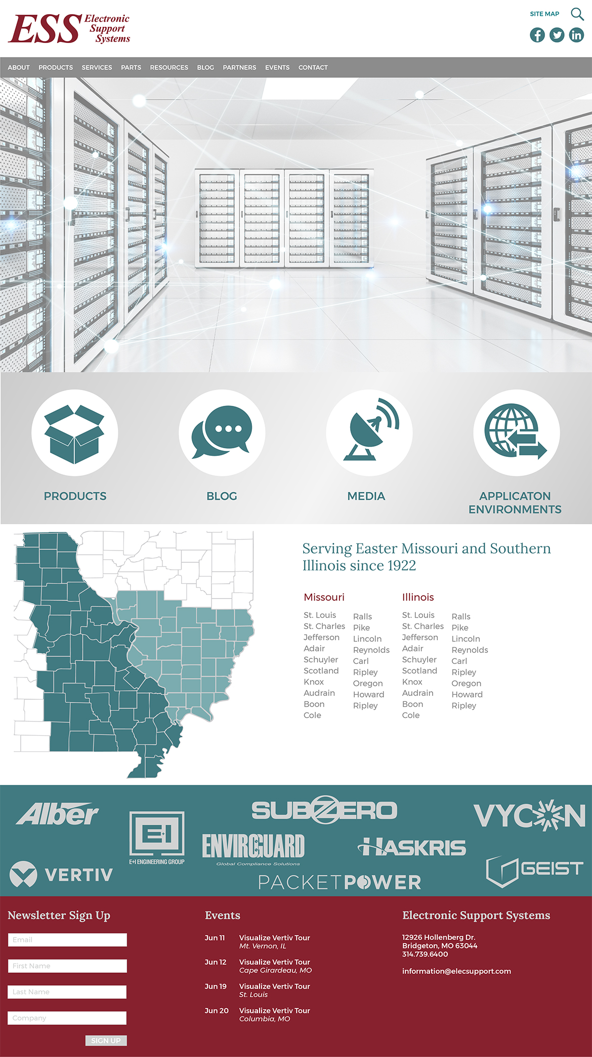
1st new interface design for ESS